
City Cat Veterinary Clinic
From hiss to bliss.
-
Timeline
May - June 2025 (5 weeks)
-
Team
Ammara Qureshi (Designer/Researcher)
Vanessa Lo
Amanda Hoang
Mengyi Chen
-
Skills & Tools
Stakeholder Interviews, Observational Studies, Storyboarding, Product Design, Metaphorical Design, Service Design, Customer Experience, Figma, FigJam, Premiere Pro
Vet visits cause stress for both cats and their owners.
The Cat City Application is a digital solution designed to streamline the client experience and reduce stress for both cats and their owners. It transforms a familiar environment into an extension of the clinic, creating additional space, minimizing stress, and improving overall efficiency with real-time updates and communication.
User Research
I conducted a knowledge audit and generative interviews across various clinic environments to understand how they approach customer experiences, and paired these insights with on-site observational studies, directly informing the user journey.
-

89%
of cats were perceived as stressed during veterinary consultations in a study observing 825 cats. [1]
-

51%
of owners reported feeling stressed themselves in a study observing 819 owners. [1]
-

27%
of cat owners consider the stress of their cat a significant factor when deciding whether to vaccinate according to Royal Canin Academy. [2]
-

43%
noticed aggression at the clinic correlated with issues such as aggression and resistance to restraint at home toward the owner in a study focused on problem behaviors at home. [3]

Knowledge audit revealed that stress and anxiety were especially high in waiting rooms for cats.
Veterinary waiting rooms are a pivotal part of the client and patient experience.
My research underscores the need for thoughtful design, efficient processes, and empathetic communication to reduce stress for both pets and their owners. Clinics that prioritize these factors see improved animal welfare, higher client satisfaction, and stronger client loyalty.

Spotlight: Aimee Castor, DVM @ City Cat Clinic
Business Owner and Veterinarian to hundreds of clients across Seattle
“When you add in unexpected walk-ins or multiple people at the front, it can get overwhelming fast.”
“We offer a non-clinical, home-like feel and adjust our approach based on each cat’s needs.”
“Noise is a big issue with people talking loudly, plus the preschool kids next door.”
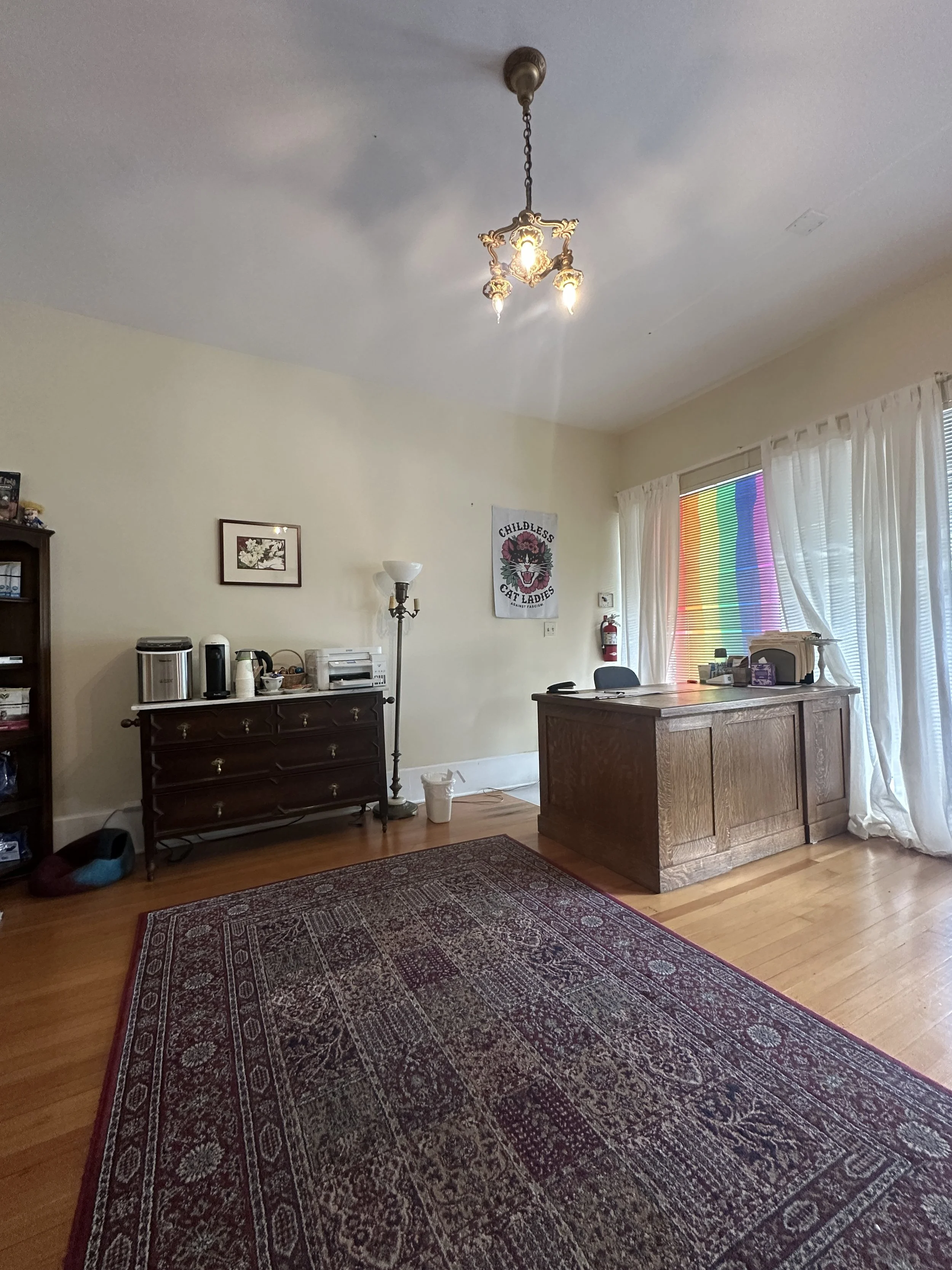
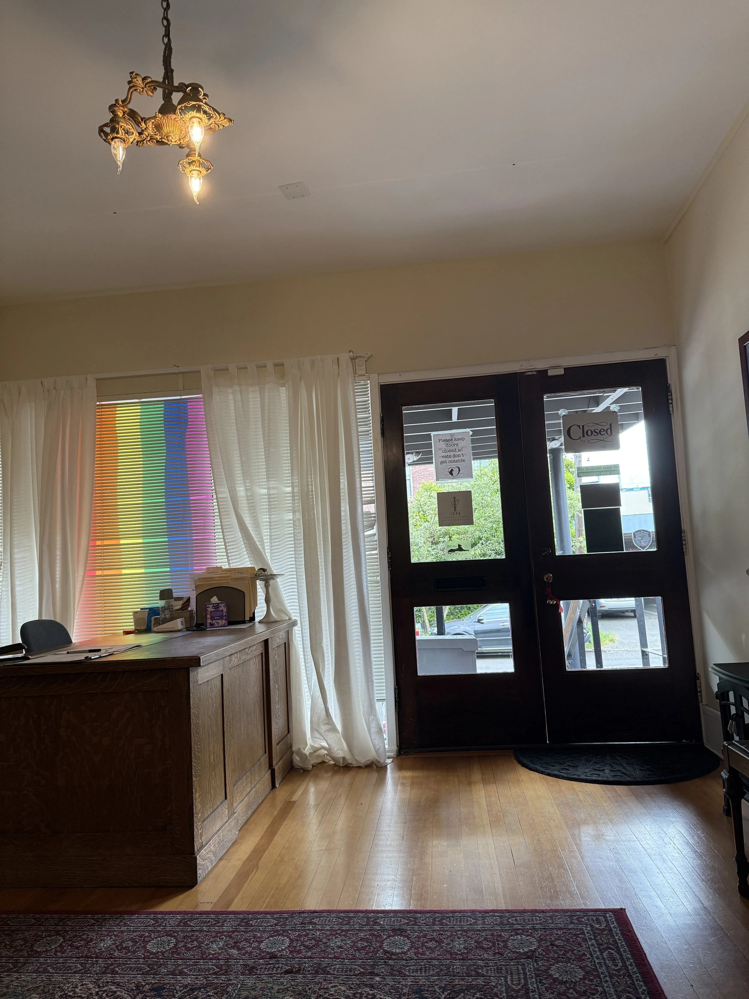
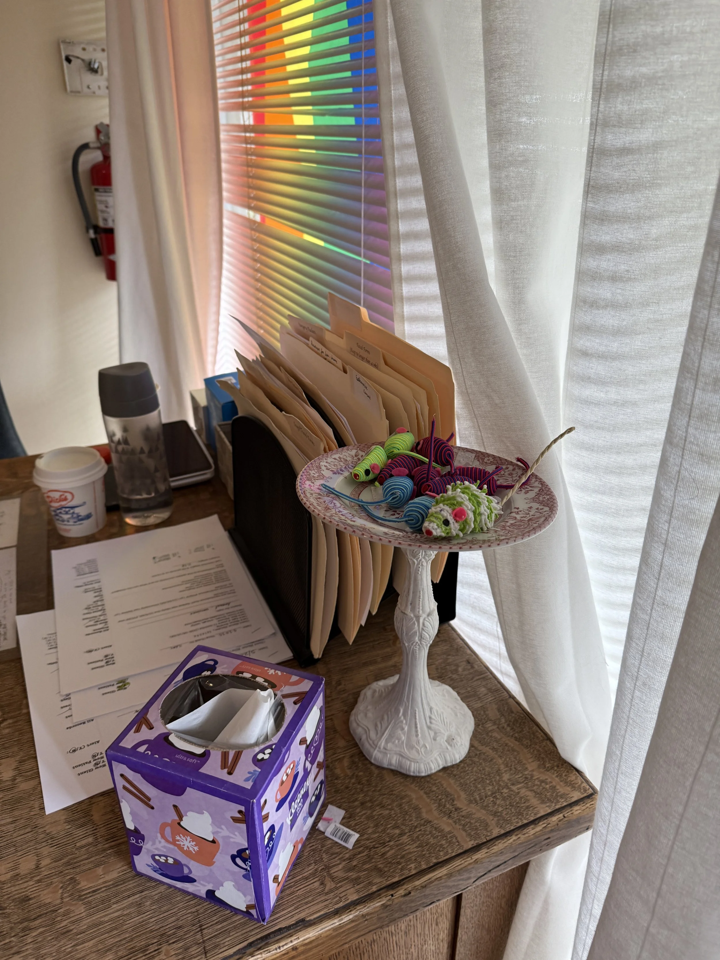
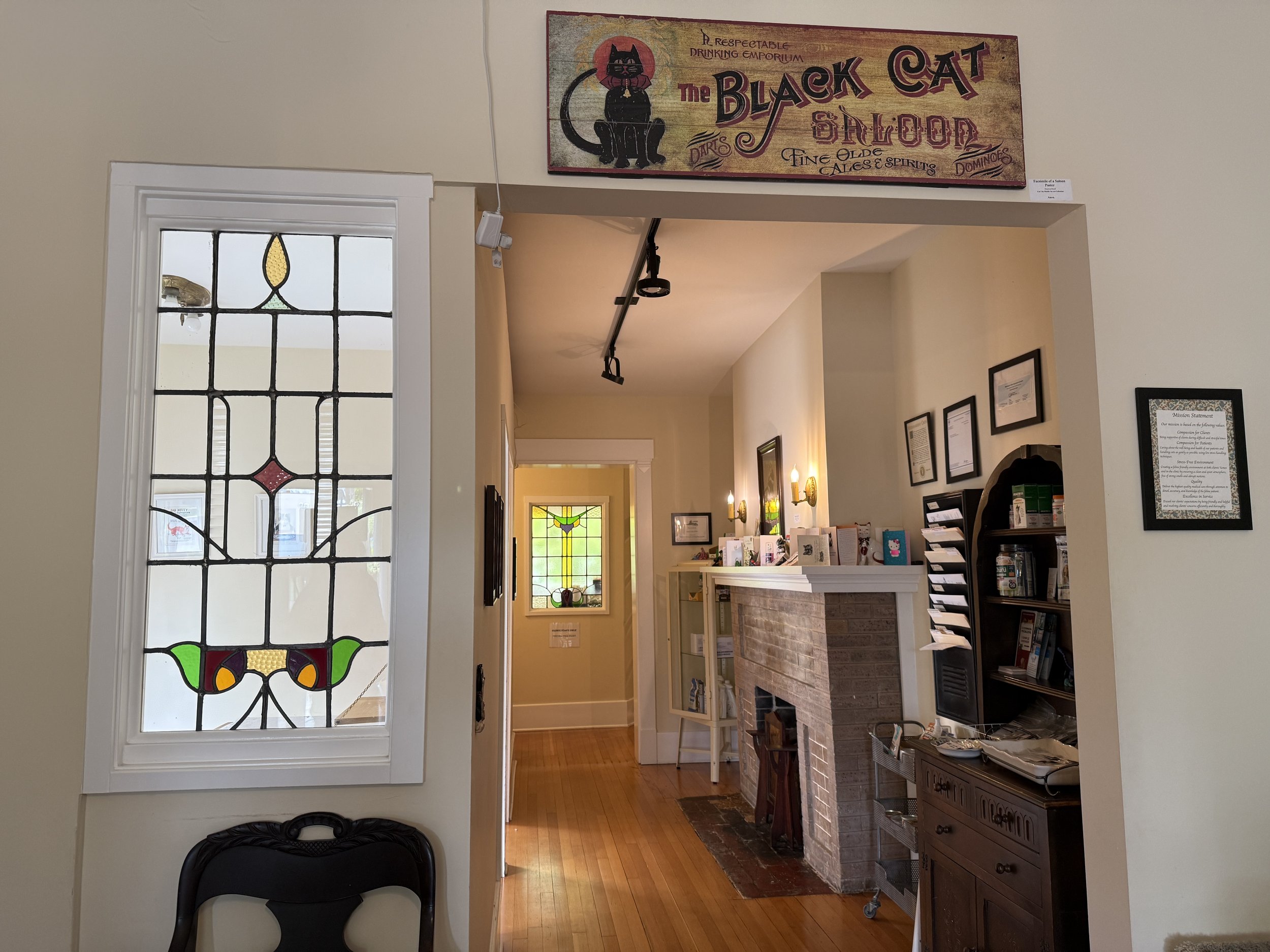
I visited the City Cat Clinic for a 60-minute session to lead observational studies on their waiting room and spoke with staff about the flow of daily operations.
-
![]()
Front entrance + parking lot for two spots
-
![]()
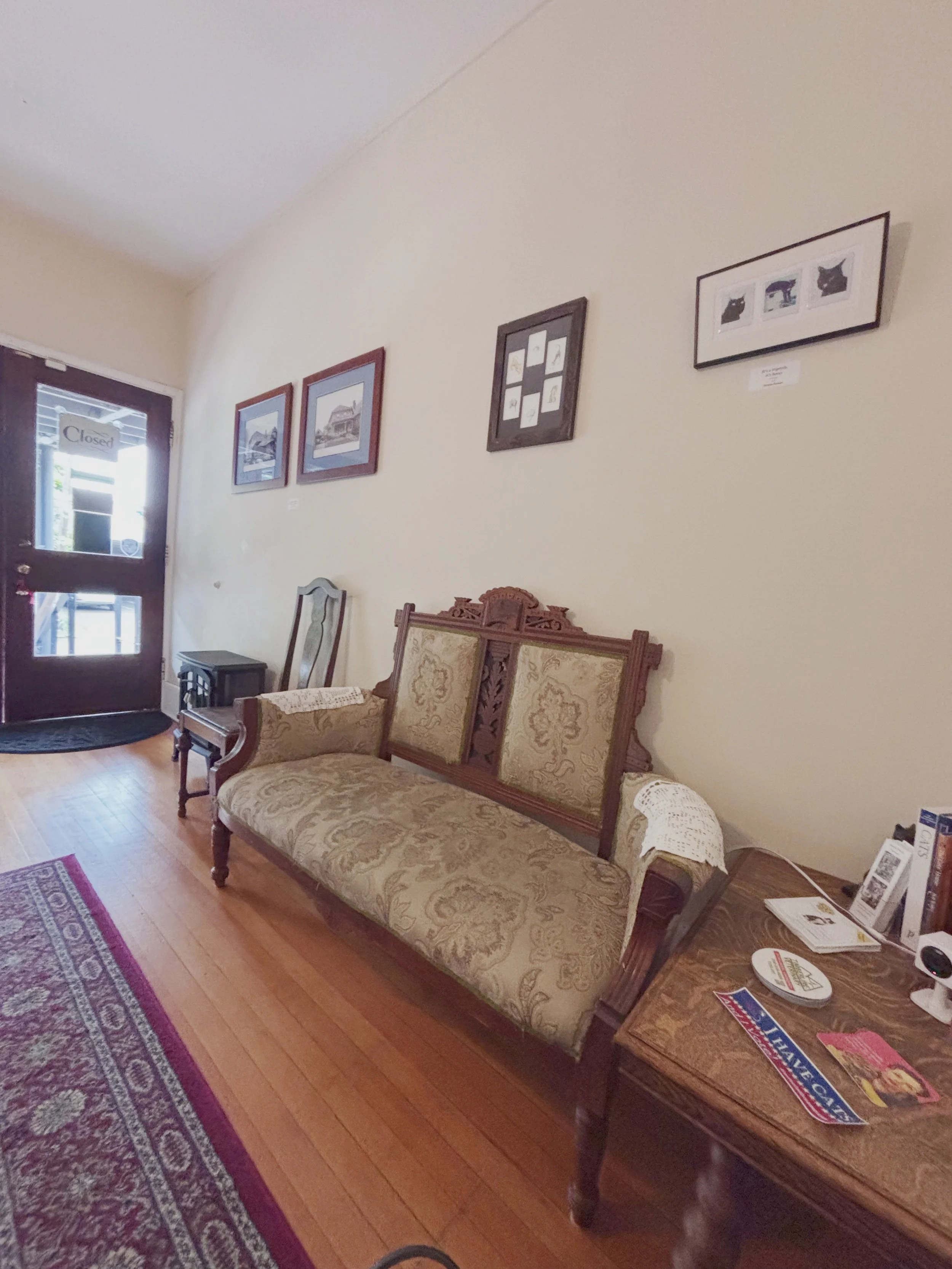
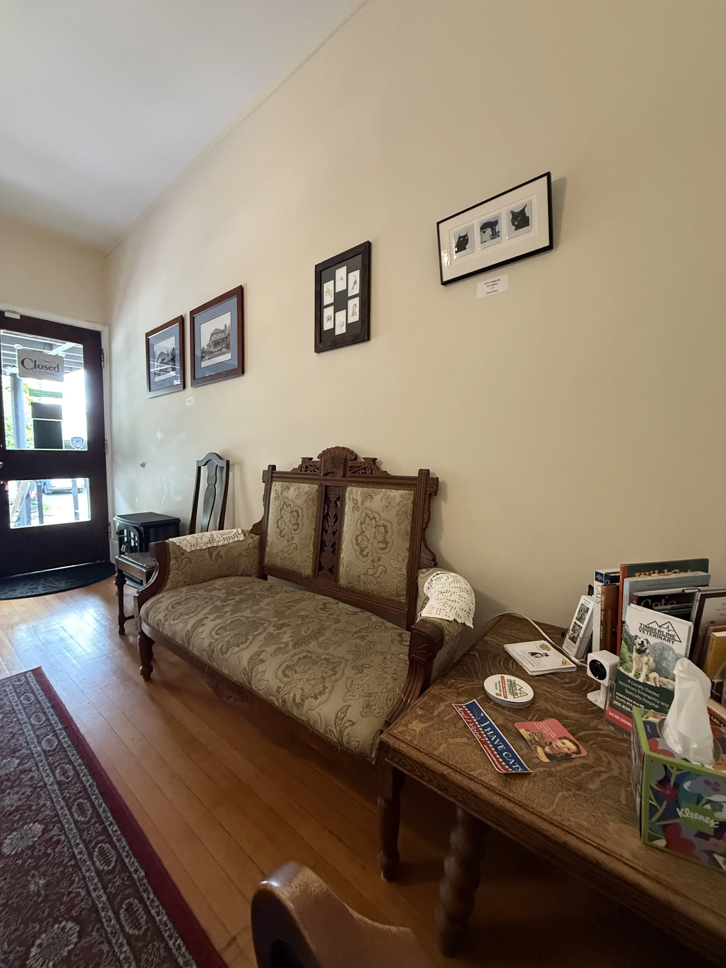
Seating area in the waiting room consisting of a long bench and two chairs
-
![]()
Side table in seating area with freebies + retail items + books
-
![]()
Self service client coffee area next to the printer which often makes loud sounds
-
![]()
Front entrance + reception desk
-
![]()
Close up of reception desk featuring cat toy favors for clients
-
![]()
Entrance into the hallway with exam rooms from the waiting room
-
![]()
Stained glass window from the waiting room peering into the exam room
-
![]()
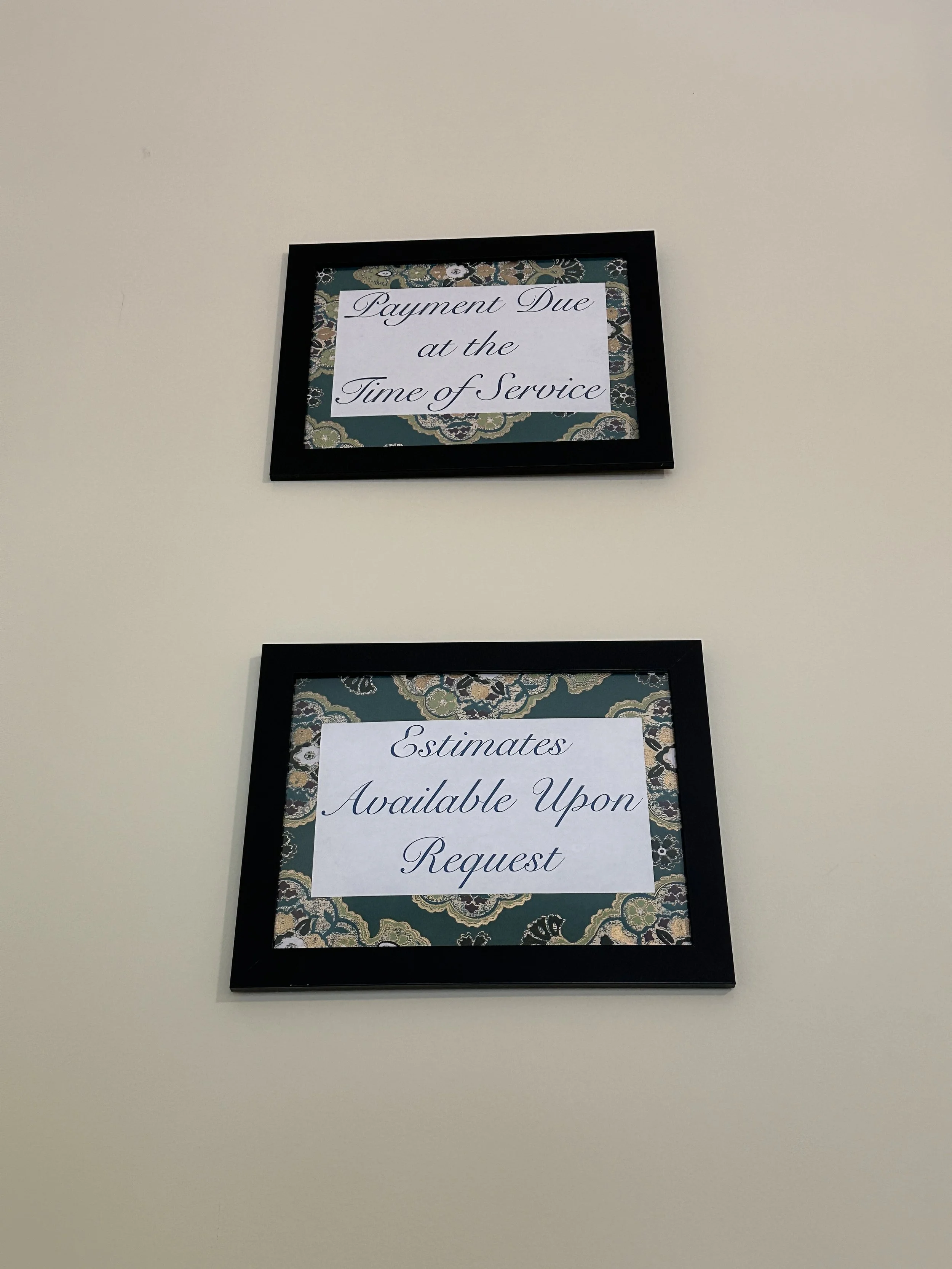
Client payment information displayed on the wall, blending in with regular wall decor
-
![]()
Exam room
-
![]()
Patient care guide given after the appointment is completed
-
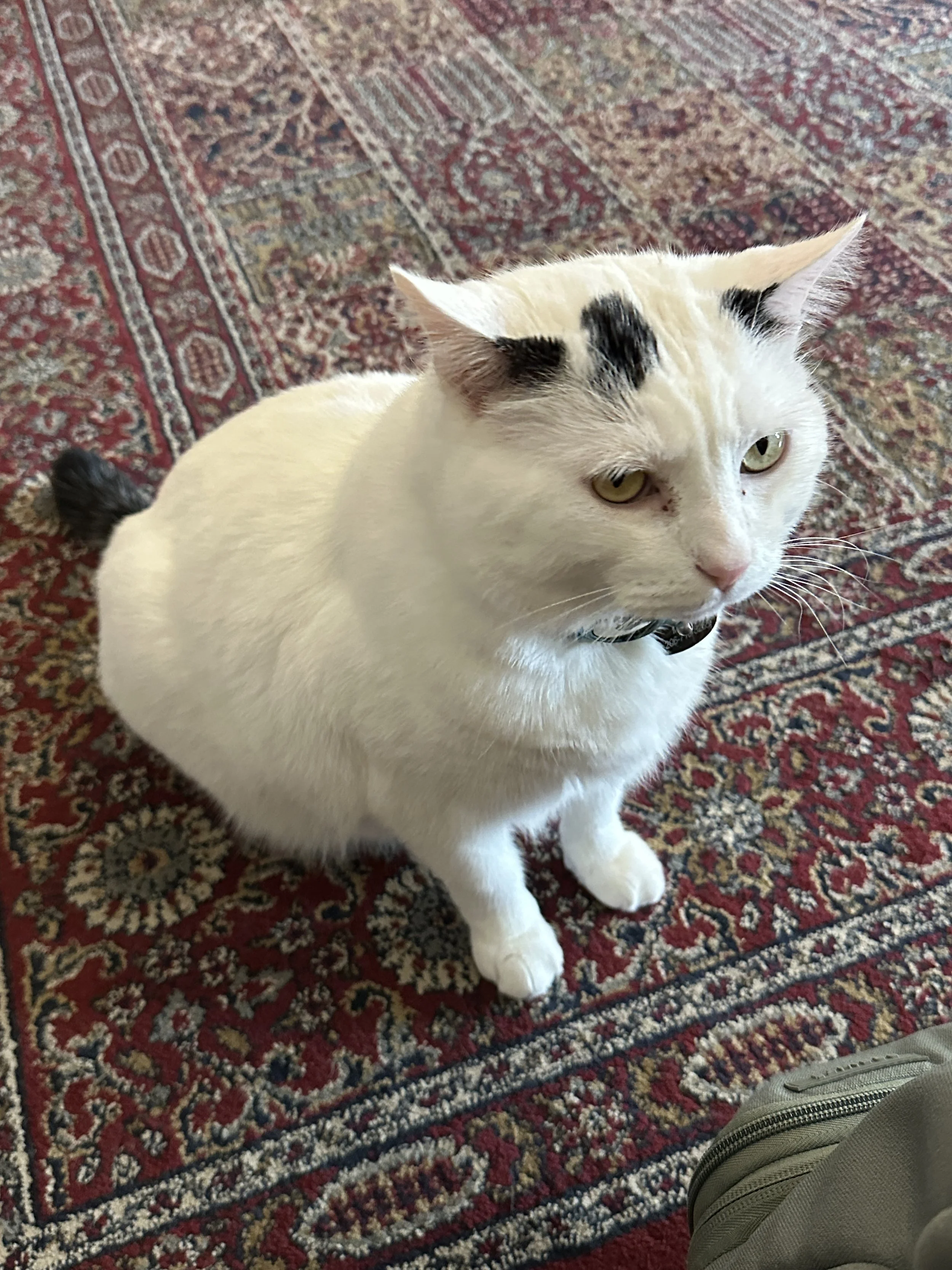
![]()
Meatball - resident cat whose presence can stress patients
-
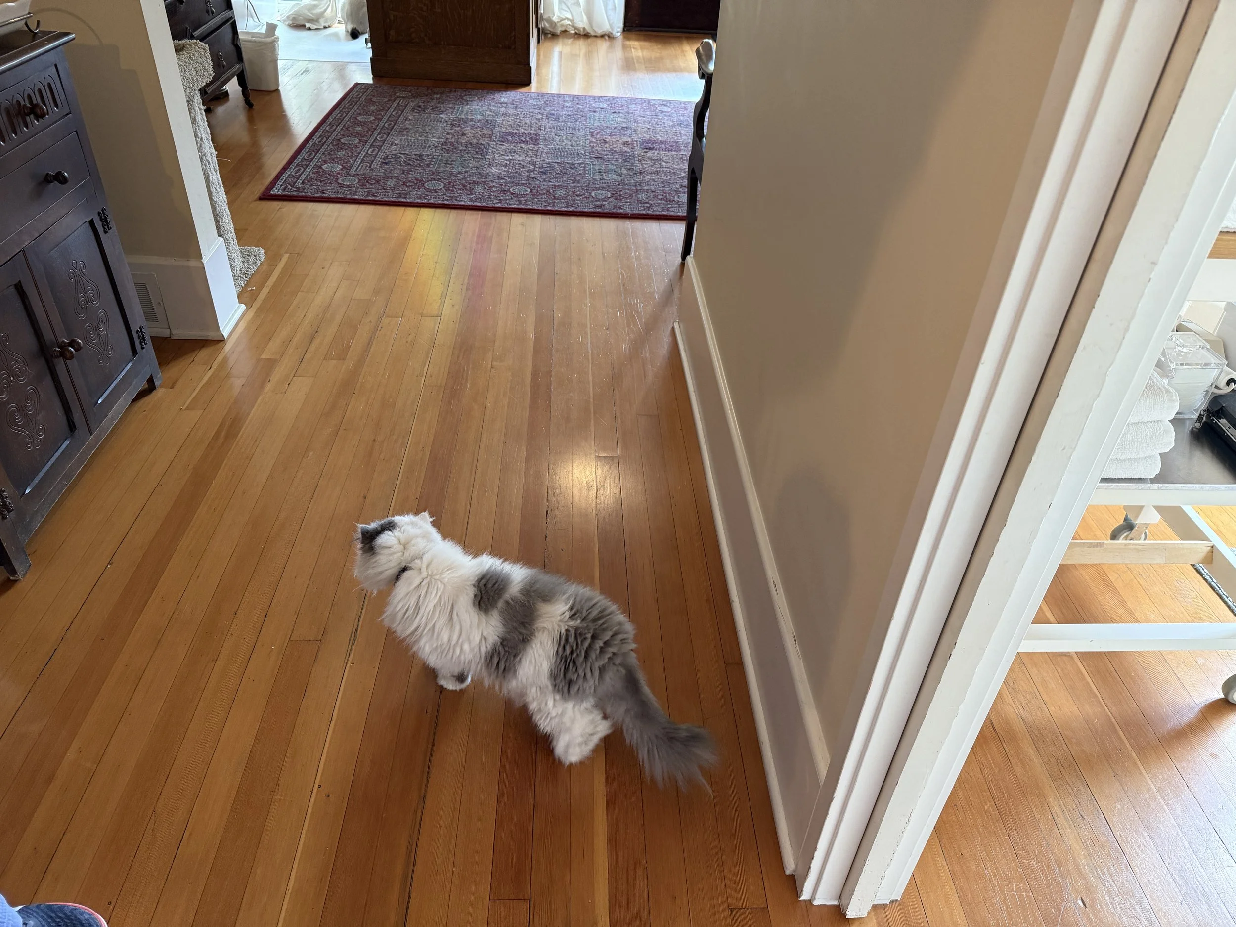
![]()
Moppet - second resident cat


I conducted 3 generative interviews with participants who were owners of small health clinics, such as ophthalmology or dermatology, since they had all navigated the waiting room experience.
📋 Walk through current customer journeys, including check-in, check-out, reminders, and EMRs, to uncover disconnects and areas for improvement.
📆 Explored how the clinic manages unpredictability, such as walk-ins, scheduling delays, or difficult patient behavior.
🚘 Included questions about spatial, environmental, and demographic factors to understand how the physical space and area influence experiences.
Problem Definition + Strategy
I mapped the existing user journey and drafted a detailed storyboard outlining each step of a first-time client’s experience, which helped identify core issues to address.
Cat owners face three major problems at City Cat:
-
No pre- arrival information is given to patients, not even through email
Digital copies of their invoices are not available so patients must keep all physical copies with them
Contact is only through email and not by phone
The setup on their Booksy platform is buggy when customers, especially new ones need to book an appointment
-
Smells from other cats
Congested seating area with only limited seating options
Too many signs are sounding the waiting room, some including important information about their visit which they might miss
Loud sounds in the waiting room (ex: printer, coffee maker, squeaky floors, preschool next door)
-
A window from the waiting room peers into the first exam room
Thin walls in all exam rooms are causing clients to hear patients in distress
Sensitive conversations with the front desk to be heard by clients in the waiting room
This is how the client’s story would pan out in the clinic:
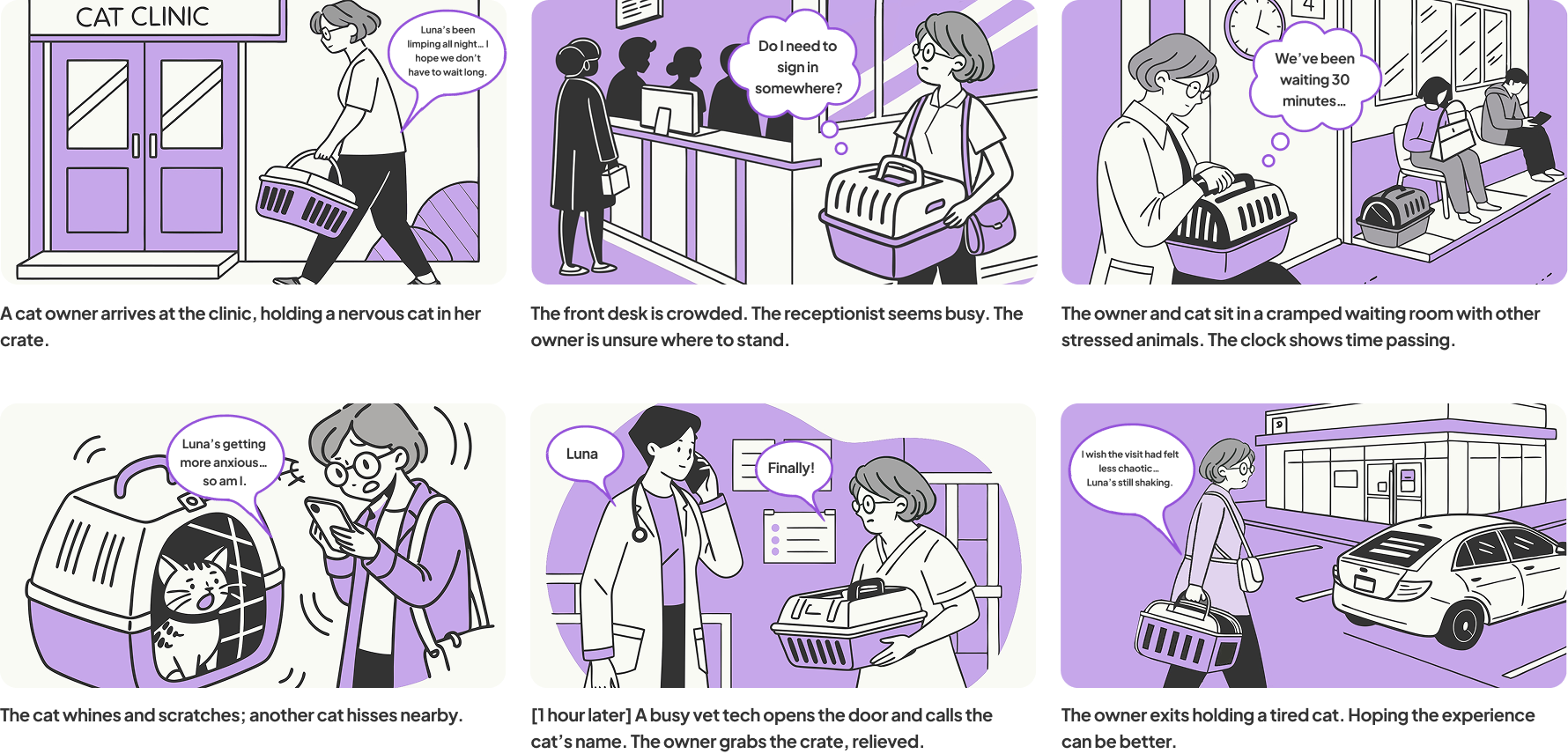
In creating the current customer journey, I focused on the first three stages because they set up the impression for the rest of the client’s visit.
Other stages of the journey involved factors beyond our control, such as how exams are conducted, constraining our solution to focus on touchpoints that occur within the clinic environment.

The primary customer I focused on was a student who just moved into the area, looking for a new clinic to take her cat in for a yearly physical.
While the clinic serves a wide range of ages, its core clientele consists of students and young professionals who typically have limited time and financial flexibility.


Ideation
I brainstormed app features grounded in the problem space, defined the desired client experience, and brought both together through a storyboard and customer journey map to guide the design direction.
I translated research insights into actionable features that reduced uncertainty, personalized care, and supported clients through every stage of the vet visit.

-
Reminders and visit-specific checklists helped clients feel more prepared and confident before arriving.
-
A customer service assistant and visit guide offered real-time support and set expectations at each stage of the visit.
-
Patient profiles allowed for personalized care by surfacing important history and behavioral notes ahead of time.
-
A real-time communicator kept clients updated when the clinic environment changed, like delays, walk-ins, or temperature issues.
-
Cost estimations based on appointment type helped reduce uncertainty and empowered clients to make informed financial decisions.
To frame the experience, I suggested a solution that would provide a premium experience for clients.
✈️ After a brainstorming session that inspired our design, we decided to mimic the virtual airport check-in process because it’s an example of an operation where people reliably prepare in advance, often with high stakes and structured flows of information.

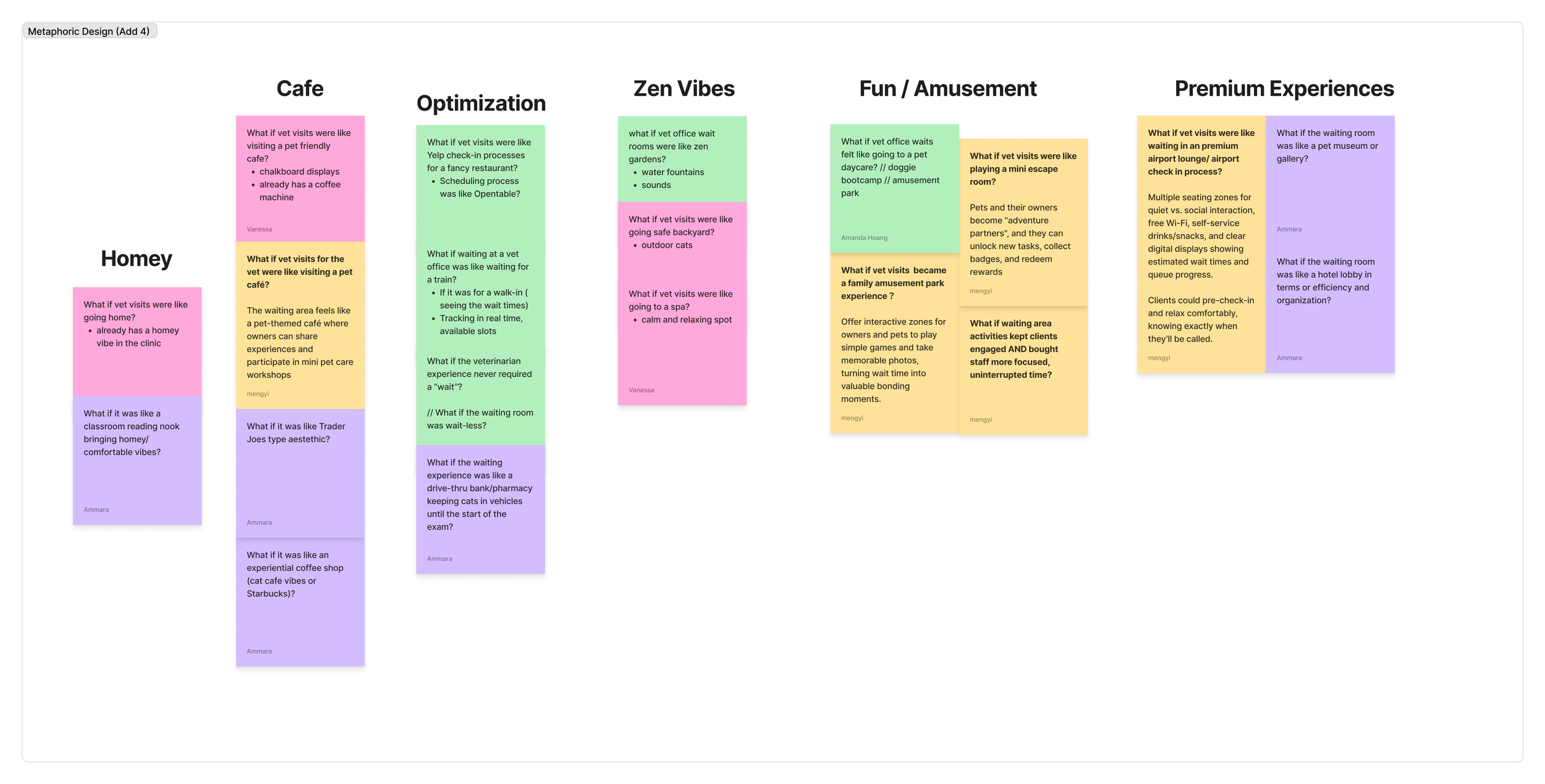


Aimed to outline an experience for the client in preparing for a vet visit in the same way someone prepares for a flight during their “check-in” process (ex: understanding flight rules, acceptable fluids/items, appropriate bag sizes).

How the solution fits into the focused customer journey map of the pre-arrival experience:
Starts with finding a vet to focus on first-time visitors
Larger emphasis on home preparation and transportation

Interaction Design + Prototyping
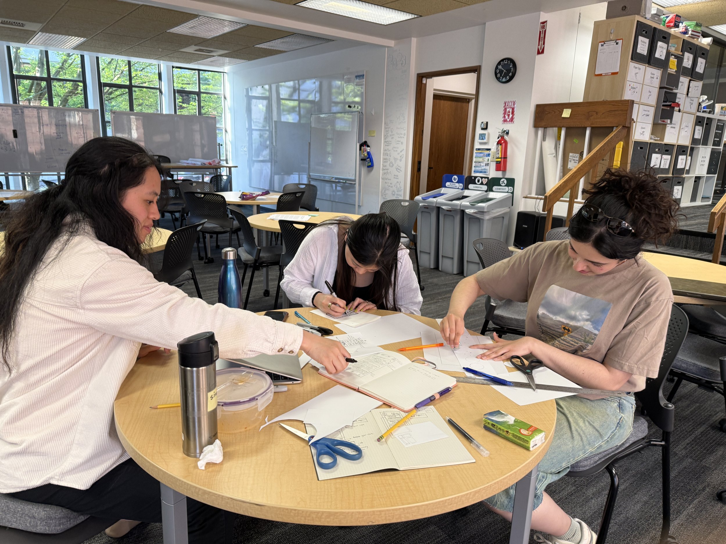
I collaborated with my team to map the app flow to identify where user pain points could be addressed, sketched early homescreen concepts based on those needs, and defined the core elements of the final layout.
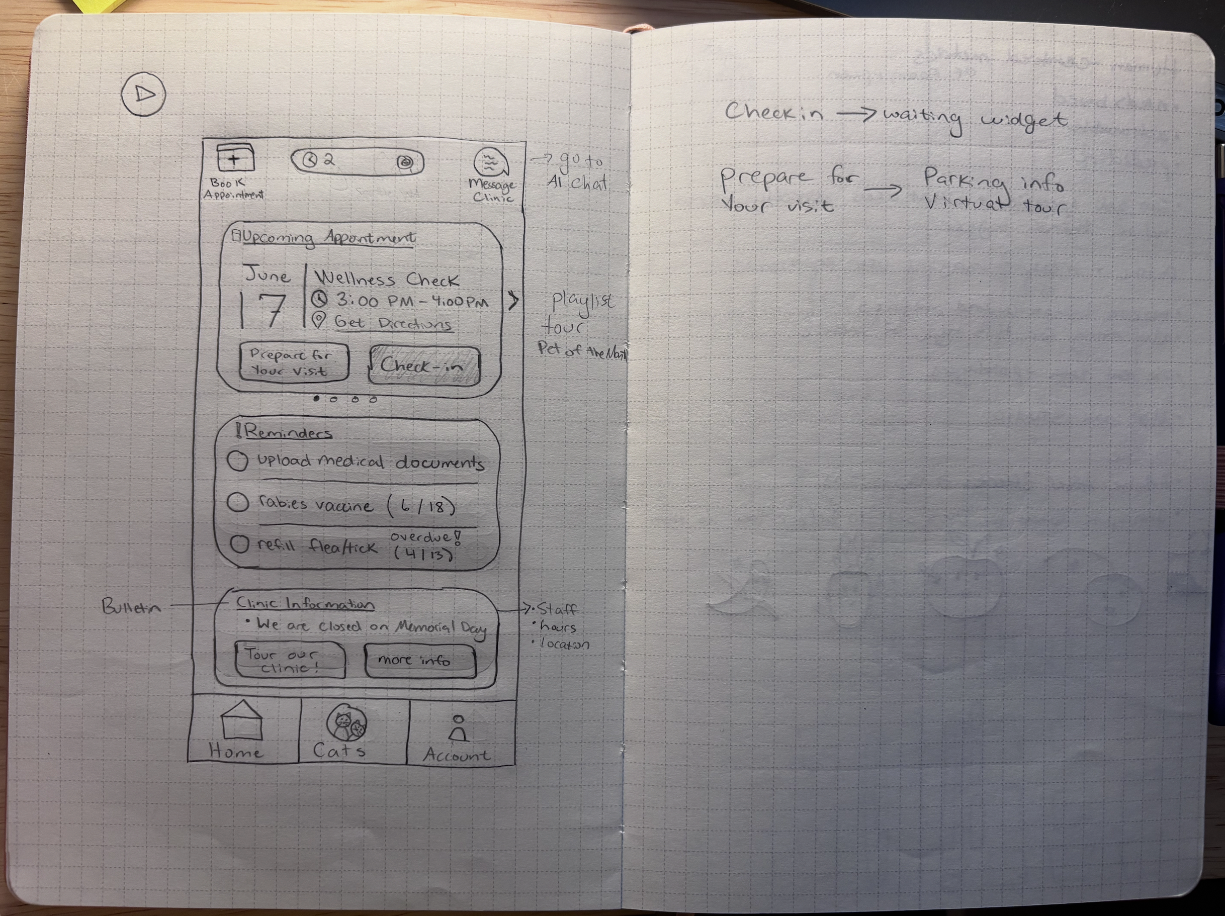

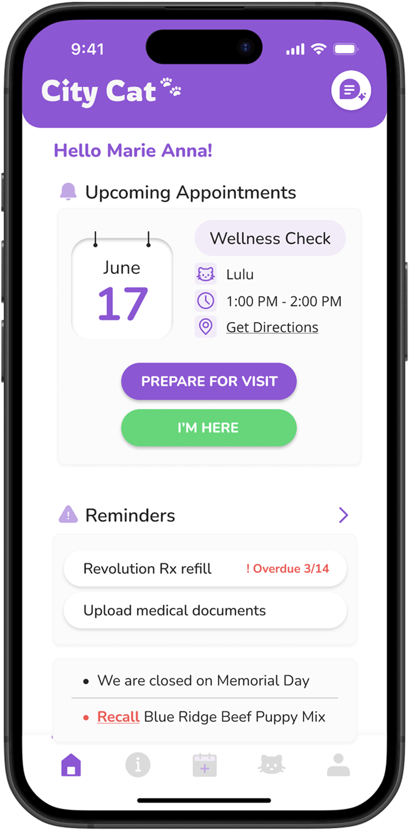
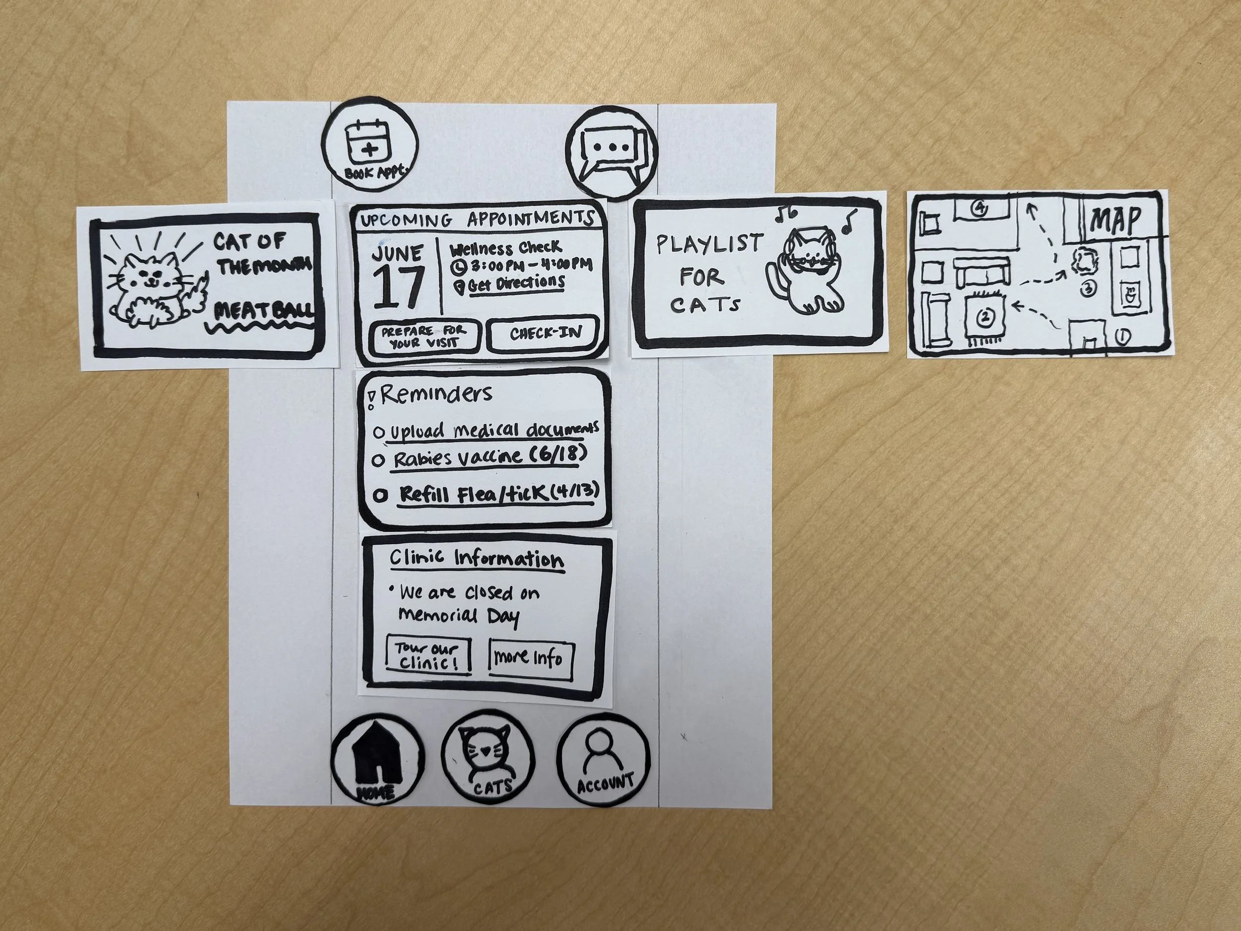
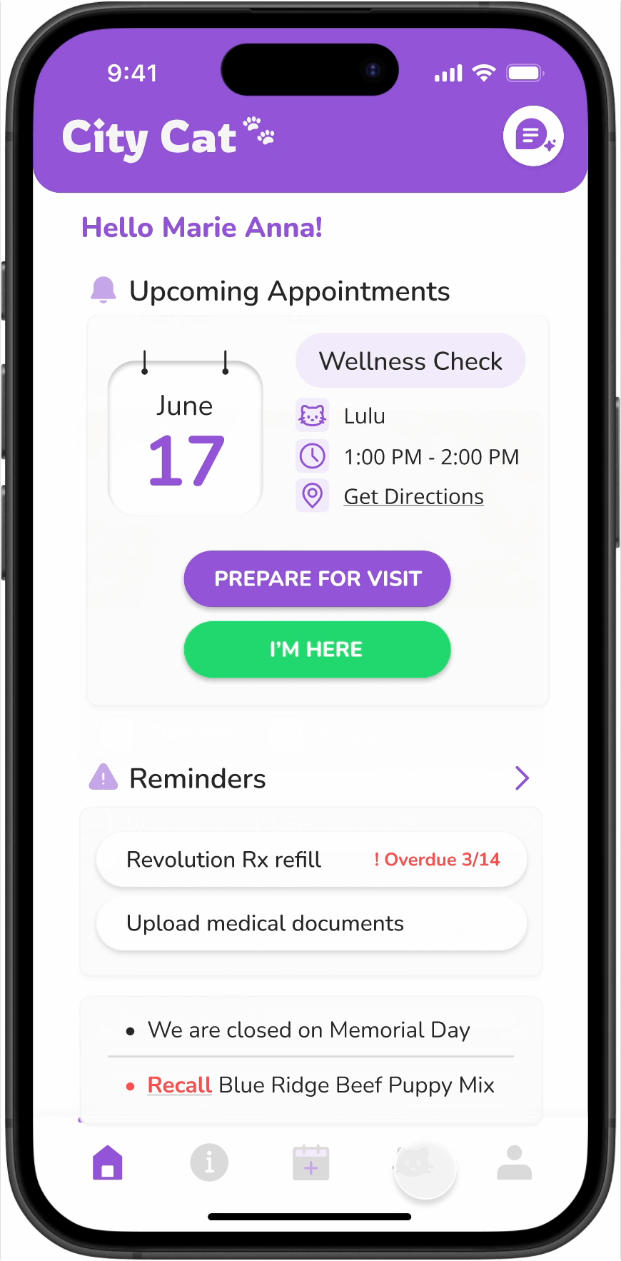
My paper prototype of the homescreen was equipped with:
Modular “Upcoming Appointments” module to prepare the client for their visit
Reminders of prescription refills
Clinic bulletin for announcements on holiday hours and recalls
Navigation for home, patient, and client profiles
AI chat for clients to message the clinic for assistance with scheduling an appointment
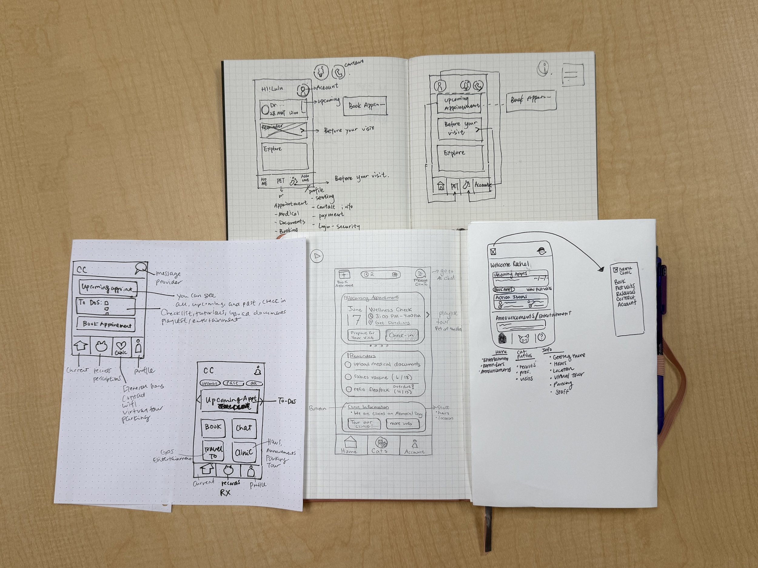
Building a collaborative solution with my team, starting with the homepage.
We started with individual interpretations of the homescreen to quickly explore layout ideas, focus on solving core user problems without getting caught up in visuals, and gather early feedback before moving into higher-fidelity design.
A card sort was designed to understand how participants naturally organized information, helping to shape the layout and content hierarchy of the homescreen.
Key functions:
Upcoming Appointments
Cat of the Month
Reminders
Clinic Information
Pet Account
Client Account
⏱️
60 minutes for moderated live usability testing
👥
11 preset categories with the ability for participants to add custom entries
✍️
5 participants who were all current cat owners and had experience taking them to the vet


The results of the card sort revealed that participants prioritized constant visibility and access to resources.
Participants expressed a strong preference for having their upcoming appointment visible at all times, rather than hidden within a modular top section. They also highlighted the need for a more robust bottom navigation, suggesting the addition of a resources tab to house key materials that were initially difficult to find since they deem them to be less of a priority.

The remaining structure of the site map was defined in preparation for high-fidelity prototyping.
Planned an app flow diagram starting from the home screen addressing most important pain points using travel apps for inspiration (ex: United, Delta, Alaska)

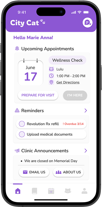
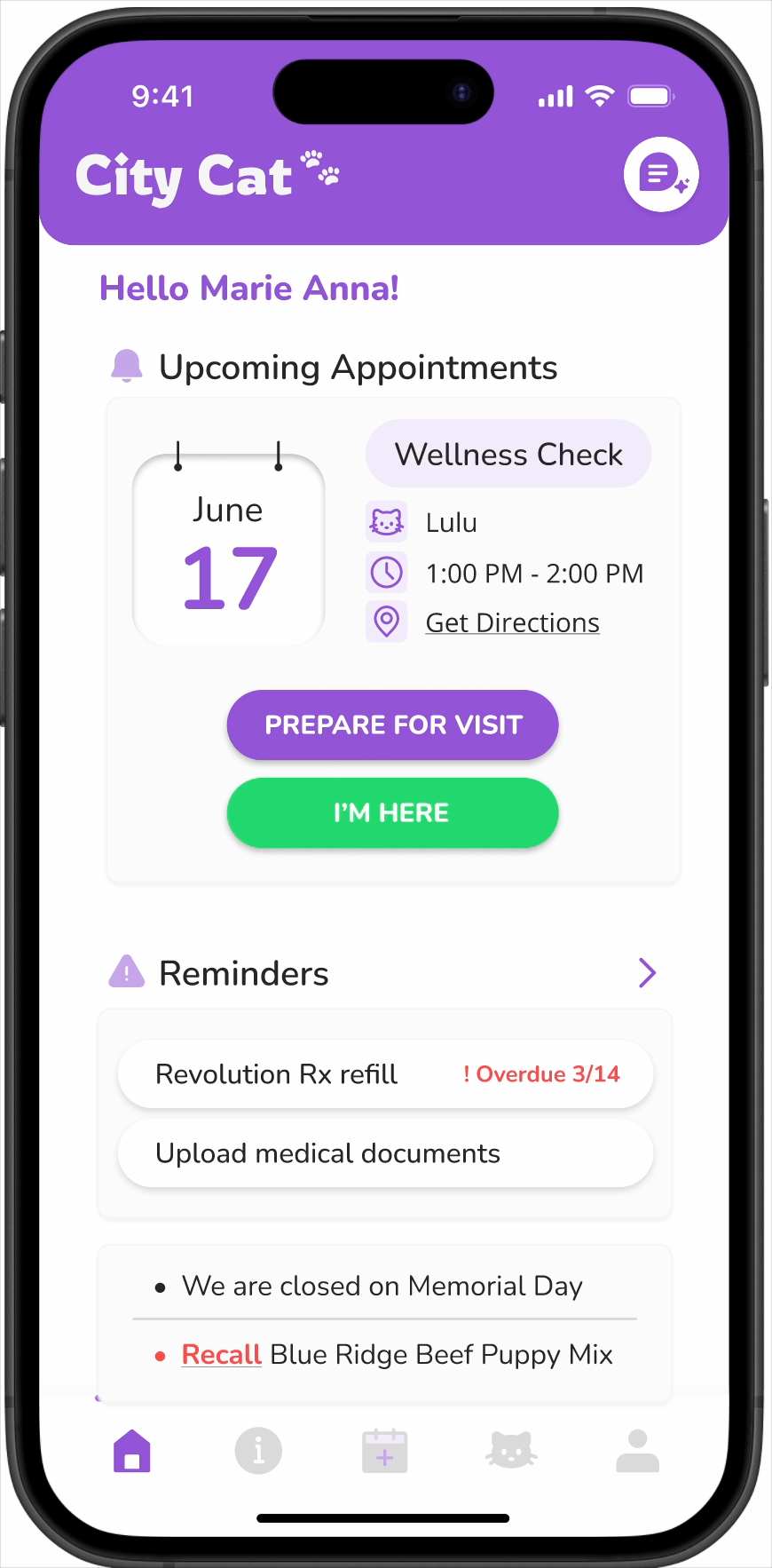
I created my own digital wireframe (left), then synthesized my ideas with the team to arrive at a unified version of the homescreen (right) that incorporated the strongest elements from each concept.
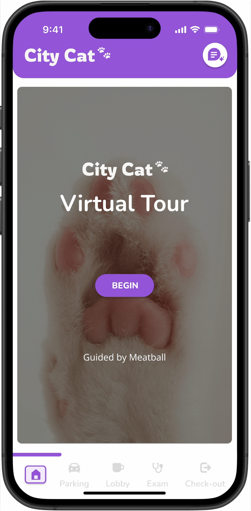
Prototyped the remaining screens, focusing especially on bringing the gamified virtual tour to life to support client preparedness and engagement.
I focused on balancing useful information with playful interactions to reduce anxiety and increase preparedness, particularly for new clients. This involved incorporating key touchpoints like waiting room expectations, check-in steps, and staff introductions into a walkthrough.

The lack of private space is addressed by transforming the client’s car into an extension of the waiting room, creating additional room and offering transparent wait times to reduce inefficiency.

Disjointed communication was resolved by consolidating booking, reminders, and checklists into one digital platform to better prepare clients for their appointment.

The gamified virtual tour helps clients turn an overwhelming environment into a familiar one by introducing staff and guiding them through their appointment as soon as they get to the clinic.
Validation + Iteration
I conducted usability testing with high-fidelity mockups, then refined the designs to reduce friction and improve flow.
⏱️
60 minutes for moderated remote usability testing
✍️
6 participants who were all current cat owners and had experience taking them to the vet
👥
Cognitive walkthrough viewing the high-fidelity prototype


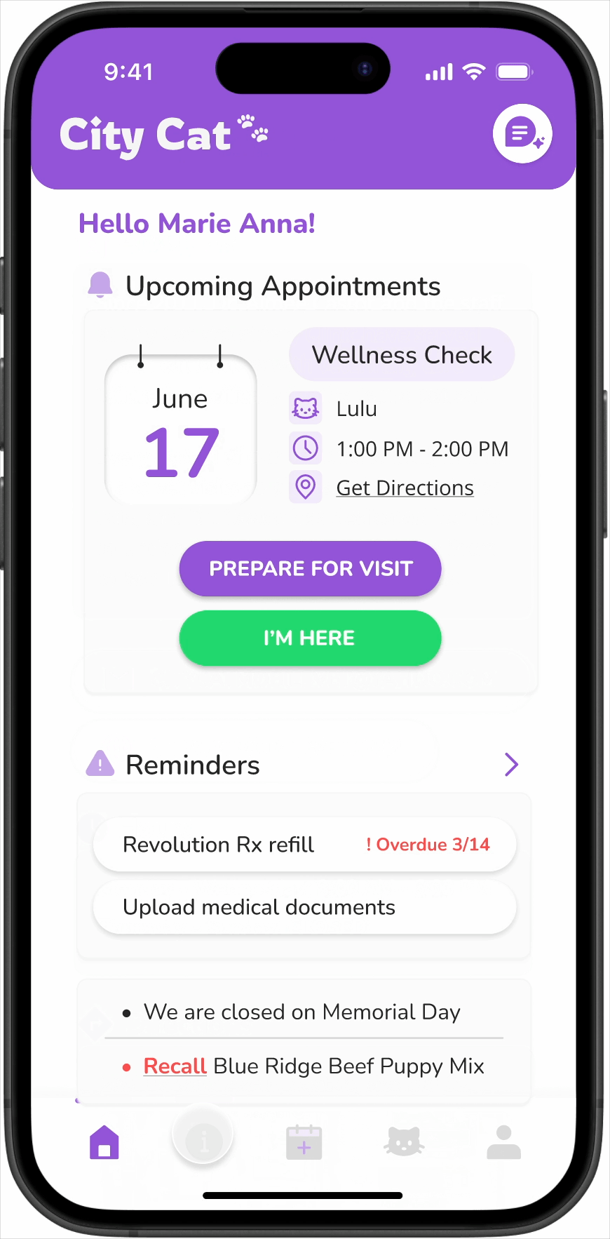
Overall, homepage impressions were positive, but needed slight adjustments.
On Wait Time: “I would rather just have you say that, or, like, tell me how long I would have to wait instead of how many patients, because that can really vary depending on the situation.” -P6
On Reminders: “Two circles look clickable for me, it's like a check box for me, there's two circles here.” - P5
On Clinic Announcements: “The “About Us” button doesn’t make sense to me here” - P4
Users didn’t just want to know what actions to take before the visit, they also wanted a clear overview of the exam process.
“I feel like these are helpful for the first time customers, but if I’m coming to the place frequently I don’t think the information is helpful.” - P5
“I would like to see the procedure of the whole process. What is the process?” - P5
”I don’t think they should be step by step but parallel to view the information at once.” - P5

While users themselves want to be prepared for their visit, they want the vet to be prepared for them too.
Users want vets to understand their cat’s behavior and personality.
“It would be nice here to put in something about behavior... I always have to call them too...hey, just as a warning, like, she's very spicy so that they can make sure that everything's going to be all set up for when I get there.” - P6
Clear after-care notes, and post-visit information was called out as being important to have.
Users needed to see their progress, reference previous locations, and wanted an easy exit.
“How do I exit in the middle of the tour?” - P5
“I wonder if there are checkpoints I could revisit, since I got a lot of information, I might wonder about parking again?” - P4
Users liked to see what it was like on the inside, was pleasantly surprised to see that it had a more homey appeal
“This is really helpful, I love this” - P5


Users found resources helpful, but not enough to warrant two different pages.
The book icon confused users, who mistook it for booking appointments rather than accessing resources, leading to swapping it out with an information icon instead.
“It’s just more information about this clinic.” - P5
In general, P4 expected to find more information about the clinic themselves and a blurb on their care approach/philosophy.
Impact
Adopting the City Cat Companion app has strengthened efficiency, client satisfaction, and reputation, with measurable benefits.

20–25% reduction in front desk bottlenecks through streamlined check-in and pre-visit prep.
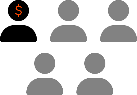
Greater transparency with cost estimates, reducing billing disputes that affect 1 in 5 clients.

“Expert team, peaceful environment. My cat loved it.”30% more positive reviews by improving visit predictability and overall satisfaction.